menu

Showing posts with label nails. Show all posts

Wednesday, June 11, 2014

Drugstore Nails -- Pastel Yellows Brand Battle

Recently, I've been on the hunt for the perfect pastel nail color. After trying out three different nail colors, I finally found the perfect one! I am horrible at painting my nails, so I tend to avoid expensive luxury brands, since I'll just make a mess anyways. Because of this, I chose to look into some drugstore polish lines to see what I could find. 

Unfortunately, the majority of pastel yellows are limited edition, which makes them even harder to find. Two of the three polishes that I'll be talking about in this post are limited edition shades, but you can still find them on the shelves of many drugstores. In photos and in the bottles, all three shades look generally the same. However, there are some very distinct differences!


First I'll start with the two limited edition shades:

Maybelline Color Show Bleached Neons in "Citrus Collide." This polish really doesn't look much like the color in the bottle. You may be able to tell in the photo that this yellow is definitely a bit brighter. I definitely understand why they named it "Citrus Collide," because I'd kind of describe it as a slightly under-ripe lemon. You know, when it still has that greenish tint to it? It is definitely much more vivid than the other two polishes, and is surprisingly usable for being a Color Show polish, which usually are a total let down for me. Not the pastel I was looking for, but a unique color nonetheless.

New York Color In A New York Color Minute in "Mimosa Bouquet." Cute name, pretty color, horrific formula. I haven't used N.Y.C. polishes since I was in middle school, I'd guess. This polish reminded me why. After two coats, the polish was streaky and sheer, but after three it becomes opaque-ish (but still patchy). It seems like it never dries. It's got a bit of a weird shimmer in it, and I suppose that's to help distract from the streakiness of the polish, but this stuff just doesn't get it done for me.

Revlon Color Stay in "Buttercup." This is the only permanent shade of the bunch, and by far my favorite. In fact, this is my new go-to pastel yellow polish. I don't know why I didn't think to buy this polish first and foremost, to be honest, because I already know I love Revlon's nail polish! It's a beautiful, creamy consistency that is opaque in two coats (but for the sake of photos, I used three). It can get a little streaky, but even I could make it work for me, and that says a lot. It's no doubt to me why this is the only pastel yellow in a permanent collection!

What is your current nail obsession?

- D. 

Thursday, April 24, 2014

Top 5 Under $5 Spring Nail Polishes

For spring, I really love pastels and vivid bright colors. I try to steer away from anything too dark, as I prefer to keep my nails short, especially during the warmer months, because I feel like it's less maintenance that way, and dark colors can make short nails look stubby! To be honest, I'm not very good at applying nail polish. I usually make a huge mess all over my cuticles, and I often say that I spend more time with nail polish remover and cotton swabs than I do with the actual polish itself.


So now, let's jump right into my Top 5 Under $5 Spring Nail Polishes!


Sally Hansen Xtreme Wear Nail Color -- Coral Reef. Coral Reef is such an incredible, vivid coral color that screams springtime! This is definitely a sunny weather color that is super on trend for spring and summer, but I find that this color really picks me up during the dreary winter months (and let me tell you, I wore it a lot toward the end of this winter because I was dying for the warm seasons!). It is a very bright coral, without being too over-the-top. I get compliments every time I wear this!


L'Oreal Color Riche Nail Lacquer -- I Pink I'm In Love. This is such a pretty baby pink color, and it's on my nails right now! I love the formula of the L'Oreal Color Riche polishes because they apply beautifully and opaquely, and are very true to color. This is such a girly color, but you could easily add a bit of an edge to it by adding a slate gray accent.


Sally Hansen Xtreme Wear Nail Color -- Lacey Lilac. This lilac color is absolutely stunning on any skin tone. I love that it is a dusty lilac color as opposed to a full on bright lilac, because it keeps it very chic yet girly. When I'm going for something a little more toned-down, but I still want a pretty color on my nails, this is the polish I reach for, especially as the seasons are changing.


Revlon Nail Enamel -- Dreamer. Dreamer is very similar to my beloved Essie Bikini So Teeny. It's not quite as periwinkle, and leans more toward a sky blue color, but it still has just a touch of purple in it that gives your nails a really unique look! It applies beautifully, as most of the Revlon polishes do, and is a great option if you are like me and cringe at the thought of spending $8 on a tiny bottle of polish. 


Sally Hansen Xtreme Wear Nail Color -- Mint Sorbet. I absolutely love mint green, and this nail color is the most perfect mint green polish I've ever owned. It is definitely much more of a grassy green color than, say, the ever-popular Essie Mint Candy Apple (which I tend to consider more of a Tiffany baby blue, although it's a beautiful color in its own right). If anything, I'd say it's more of a dupe for Essie Fashion Playground, but for less than half the cost!

You may notice I really love the Sally Hansen Xtreme Wear Nail Color! It is probably my most favorite brand of drugstore nail polish, simply because it's so inexpensive, long-wearing, and it applies like a dream! They have a great selection of colors, and according to their website, they sell it in a lot of countries.

What's your most worn nail color this spring?

- d.

Saturday, March 1, 2014

February Favorites!

For some reason I feel like this month was just not very exciting in terms of beauty products for me. I've spent most of this month just kind of lounging around, so this month I have a few beauty favorites as well as a couple of random favorites!

Let's start with the beauty favorites.


Urban Decay Super-Saturated High Gloss Lip Color -- Punch Drunk. For most of January, I was trying to hunt down the perfect orange lip color. I didn't want it to be too neon or blue-toned, but I didn't want it to be too warm-toned either. I just wanted a very true, vivid orange. This lip pencil was the perfect color for me! I adore this lip pencil, and it's so hydrating and vibrant, while still have some good staying power. This month I've consistently been looking for excuses to wear this color, and orange lips is a huge trend for this spring!


Essie Nail Lacquer -- Bikini So Teeny. "Bikini So Teeny" came out with the Summer 2012 nail collection, and ever since I first saw it, I fell in love. It's a color that I always told myself I would buy, but never did, and after my first bad experience with Essie polishes (with a light green color that I can't remember the name of), I told myself I'd never buy Essie Polishes again. Of course, I did again, with "Butler Please," which I wasn't a fan of, and then again, with "Vested Interest," which I fell in love with. And yet again, I have found an Essie polish that I love! "Bikini So Teeny" is the perfect periwinkle color. It is a bit sheer, so be patient when applying it, but when it's on, it's absolutely gorgeous.


Physicians Formula Glow & Mood Boosting Powder -- Translucent. This product was a happy accident. I'm not exactly sure what I was thinking when I bought it, I guess I expecting a very, very pale blush, but it is actually a setting powder! It's got the slightest iridescence to it, which helps to blur any imperfections and add a glow to the high points of your face, without making you look oily. Plus it smells good! It works really well for me, especially in the areas where I tend to get dull and dry.


Aeropostale "Can U Not" Graphic Tee. If you follow me on Instagram, you'll probably be familiar with this shirt already. This graphic tee is from the Bethany Mota collection by Aeropostale. Like I said in my Teens For Jeans post, I worked for Aeropostale for two and a half years, and I think it's such a wonderful company! Plus, they have some great, affordable jeans that are almost always on sale. But this is a crop top graphic tee and on the front it says "Can U Not." Anyone who knows me in real life knows that these words come out of my mouth multiple times on a daily basis. My best friend and I were being mall rats, and when we saw this shirt, I knew I had to have it! Like all of Aero's graphic tees, it's super soft and goes from sizes XS to XXL.


Cartwheel by Target App. I feel like I spend a good portion of my life in places like Target. A few months ago, Target came out with a coupon app available in both the App Store and on Google Play, and of course, as soon as I heard about it, I had to download it. It was super helpful during Christmas time, and I feel like, over the past month, I've been obsessively using this app for everything. It's basically couponing made easy -- you just sign in via Facebook or email and select your coupons. Once you get to the register, just scan the app barcode! If you have a Facebook, you don't have to sign up or give them any information, which makes it even easier.

What were your favorites of February? What kind of posts would you like to see next? Leave me comments and suggestions down below!

- d.

Saturday, January 11, 2014

Katniss Everdeen's Tribute Parade Look

Now we're back to the Catching Fire mini-series! We're almost done, just one more look, and in the next post, I have a surprise!

This is the look Katniss wears in her second tribute parade, before entering the arena for the Quarter Quell.


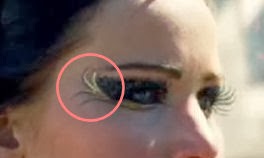
Jennifer Lawrence's makeup artists definitely didn't hold back on the glitter in this movie. It looks like it's a pretty chunky black and gunmetal glitter on her eyes, and a gorgeous gold liner, almost like feathers.


Despite being fairly simple, this look is very messy, and I made sure to keep cotton swabs and makeup remover on hand at all times. To create a solid base for the black shadow, I took a Milani Liquid Eye Eyeliner Pencil in "01 Black" and created the shape I wanted for my lid. I took it up through the crease, being very particular about where I placed the product. I used my finger to blend the cream color out, then I took a matte black shadow and a flat shader brush and pushed the color into the liner, to prevent fallout. 


After I placed the color, I took a cotton swab and some makeup remover and went along the edges to clean up any fallout, and to create a crisper edge. Next, I took a gunmetal cosmetic glitter from Claire's and, using the same flat shader brush, I pressed this into the black shadow. I held a tissue under my eyes to prevent the glitter from getting everywhere. 


Now comes the hard part. I took NYX Loose Pearl Eyeshadow in "Yellow Gold" and mixed it with a spray of my Mac Fix+ to create a paste. I used this for the feathery strokes along the outside of the eye. I took a precision liner brush and very carefully and quickly drew in the strokes. I also took this wet shadow under the lower lashline, stopping at the inner corner. Before the product completely set, I took the loose shadow, dry, and patted it over the wet shadow to brighten it up. 


I completely forgot to take a picture of this next product, but if you've been keeping up with this mini-series, you'll recognize the product from Johanna's Tribute Parade Look. I wiped off my precision liner brush and took my Maybelline Eye Studio Lasting Drama Gel Liner and carefully lined the accent points on the feathery strokes.


After I accented the feathers, I again took my Milani Liquid Eye Eyeliner Pencil and lined my upper and lower waterline, as well as my lower lash line. Finally, I applied a pair of generic eBay lashes, like I did in my last Katniss look.

I used Rimmel Professional Eyebrow Pencil to fill in and straighten out my brows, much like Jennifer Lawrence's.This brow pencil is great for on-the-go because it comes with a brow brush on the cap! I highlighted the browbone with my MAC Studio Finish Concealer in NW25 (which actually isn't even the right color for me, but it works well for this step). 

From here, I did my face, layering my foundation for a more flawless finish. On the cheeks, I used my trusty Inglot 358 Matte as a light contour, and the mauve-toned blush from my Morphe 10 Color Blush Palette. Since her lips look pretty natural, I simply applied my Jack Black Intense Therapy Lip Balm


For this look, I decided to do something a bit different, and do some Katniss inspired nails! 


For this manicure, I used a gorgeous berry color on my nails, which was Revlon Nail Enamel in "Bewitching." On the accent nail, I used a polish from CoverGirl's Limited Edition Capitol Collection, which is called "Seared Bronze." I got this polish in a pack with the nail stickers in the style "Tawny Flame," which I also used on my nails for this look. I was actually quite impressed with this bronze polish from CoverGirl. The glitter was gorgeous and it was so opaque! It looks especially amazing in natural sunlight.


- d. 

Friday, November 22, 2013

Face and Outfit of the Day -- Job Interview Edition

So today, I had my second interview at Sephora (woo hoo!)

I thought that, because Sephora is such a fun place for makeup, I would show you the makeup I wore for the interview, as well as the outfit (which is significantly less exciting, but it may help some of you who are looking for some good professional attire!)

I'll start with my outfit.


We'll go from head to toe! My headband is from Icing. I bought it a few holiday seasons ago so I'm sure they don't have it anymore, but it's just a simple bow headband. It is pretty similar to this headband, though, which is also from Icing. Around my neck is my beloved bow necklace that I actually haven't worn in quite some time. I got it from eBay, a few years ago, and can still be found here! It is a gorgeous gunmetal color, and the photos online definitely do not do it justice. My shirt is a basic black t-shirt from H&M, which is tucked into a slitted pencil skirt from Target. This is another one of those items that I bought quite some time ago and is no longer available at Target, but black pencils skirts are a staple and can be found just about anywhere! My shoes are also from Target, and definitely aren't as cute in the picture as they are on my feet! Plus, they are SO comfy, and wear really well. I tend to walk with my toes up (from a few good years of marching I assume), so a lot of shoes wear out around my toes really quickly. My belt is the same belt I wore in my last OOTD, which actually belongs to my best friend, so I am not sure where it's from.


My nails were inspired by +leighannsays, and I used my L'Oreal Color Riche Nail Color in "Eiffel For You" with my N.Y.C. Longwearing Nail Enamel in "Plaza Plumberry" for the triangle accent. It's the first time I've ever done a manicure like this, so it's anything but perfect, but I think it turned out pretty well for a first time try! 


The look I wore today was definitely a fall-inspired look, with some oranges and wine colors. Unfortunately, my camera was going crazy today and didn't seem to want me to be able to get a very good photo of it. Also, please excuse my crazy hair. I am in desperate need of a good hair mask. 

First, I used my Too Faced Primed and Poreless face primer, and over that, my L'Oreal True Match Foundation in the shade C2. Then I went straight into the brows, with Inglot 358 Matte and my Ardell Brow Sculpting Gel (not pictured). Then, I ran my Rimmel London Scandaleyes Waterproof Kohl Kajal in "Nude" to help shape and define my brows just a bit more. Then, I applied my Urban Decay Primer Potion (not pictured) to help my shadows stay put. Then I went in with my Coastal Scents 252 Ultimate Palette


This palette comes with three tiers of shadows: one with cools tones, one with neutral tones, and one with warm tones. I used the warm tier, and applied a shimmery peach color on the inner third of my lid. I then took a matte plum color and rocked it in my socket as well as the outer corner, being careful to blend it out really well. I then used a bright matte orange to add an extra pop of color on the center of my lids, as well as a matte brown to deepen the plum in my outer corner. I also ran the shimmery peach color along the inner corner. 

After applying my eyeshadows, I went back in with my Maybelline Eye Studio Lasting Drama Gel Eyeliner in "Blackest Black" and created a defined winged liner. It's a bit difficult to see in the picture, unfortunately. I then took my nude Rimmel pencil and ran it in the lower waterline, as well as under the wing to give it some extra definition. 

After all this was applied, I went in with my new holy grail concealer, the Rimmel London Wake Me Up Concealer in Very Fair. I applied this to the undereye area, as well as down the bridge of my nose to add a bit of highlight. This concealer is amazing for my dry-combination skin. I then went in and powdered with my Revlon Photo Ready Translucent Finisher, and contoured with the same Inglot powder I used on my brows. On my cheeks, I used my favorite blush (of all time), Wet 'n Wild Color Icon Blusher in "Mellow Wine," and on my lips, my Wet 'n Wild Megalast Lip Color in "Sugar Plum Fairy." Finally, I used my Maybelline The Mega Plush Volum' Express Mascara. And of course, I spritzed some Mac Fix+ to add a lovely finish to the skin!

- d. 

p.s. in case you were wondering, I got the job!

Monday, November 18, 2013

L'Oreal Color Riche Nail Color Update

About ten days ago, I posted about the two new Color Riche Nail Colors that I bought. They make a claim that the polish lasts 10 days, and I decided to put it to the test.

Okay, so I didn't really put it to the test, because my nail OCD unfortunately didn't allow me to. However, since that post, I have tried both shades that I purchased, "Eiffel For You" and "Charmed, I'm Sure." I can certainly say that "Eiffel For You" has impressed me. It is a gorgeous taupe creme color that is perfect for fall. It goes on so smoothly, and I wore it for 5 days before it started to barely chip. The chipping in the polish was barely noticeable and rather minor, but I had a job interview on what would have been the 6th day, so I removed the polish and in it's place applied two coats of "Charmed, I'm Sure," which is the rose gold polish I purchased.


In the photo, it doesn't quite appear as a rose gold, and that's because it's definitely a bit of a nude rose gold. It is much pinker in person than in photos, but it is absolutely gorgeous. I have said countless times that I look awful in rose gold, and I always wished I could jump on board with this trend, and now I finally can! 

Unfortunately, it isn't quite as opaque as "Eiffel For You." It does apply a bit unevenly, and I almost feel that two coats isn't enough for full coverage. It also definitely highlights the awful ridges in my nails, something that creme polishes typically don't do. However, this polish also lasted 5 days before it began to slightly chip. This time, I felt I was ready for a good manicure anyway, and took it off. But right after I was done with my nail regimen, I reapplied "Charmed, I'm Sure" all over again. It's definitely a gorgeous color and I'm so excited to finally be able to jump on board with this trend!

I think the #1 thing for me is that it lasts about a week before starting to chip. The reason I don't wear polish often is that I don't like having to deal with it after a couple of days when it has already begun to chip. L'Oreal's Color Riche Nail Color line is definitely a low maintenance nail color that comes in a huge variety of colors, and I definitely would recommend trying it out!

- d. 

Friday, November 8, 2013

For the sake of beauty blogging...

+Andrew  is going to be mad at me because I caved at the drugstore today.
I bought two nail polishes, both from L’Oreal Paris’s Color Riche line. These polishes claim to have 10-day wear. Personally, I can’t imagine anything lasting that long on my nails that isn’t acrylic or gel. But, time to find out!

Anyways, the two colors I bought were “Eiffel For You” and “Charmed, I’m Sure.” Currently, “Eiffel For You” is on my nails.


As you can see, it’s very much a true taupe color. It’s also one of those “I have something like it, but it’s not exactly like it so I’m going to buy it anyways” colors. My boyfriend would say “It’s just like that other nude one you have” (aka Sephora by O.P.I.’s “Don’t Feed the Hand Models”). The thing is, that one is a nude. This is a taupe. Aaand this is me justifying my purchase.


The other color I bought, “Charmed, I’m Sure,” is a color I really hesitated about getting. It’s a rose gold. I’ve said a million times that I look horrible in rose gold. Or really just any gold in general. But I’m hoping that because this color is a bit more on the pink side, it will look good on me. And if it doesn’t, I can always give it to a friend. 


One of these days I’ll figure out how to make my fingers photogenic. 

-d.